
Apple Music is introducing a new brand identity centred on the idea of “made by sound,” bringing together music, visual design and technology in a refreshed look that extends across its marketing, products and experiences.
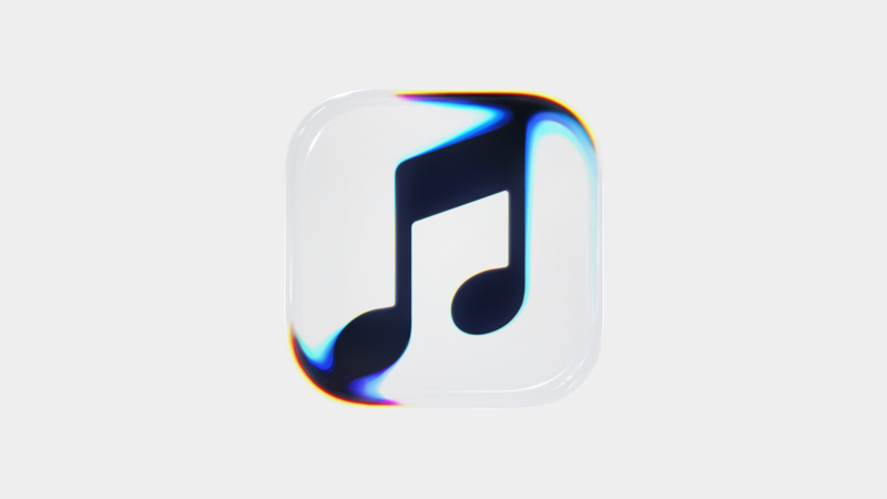
The redesign includes a new logo mnemonic, an updated wordmark and an expressive musical note icon, all developed around the idea of turning sound into a visual experience. Rather than simply illustrating music, the creative approach uses the physical movement created by audio to shape the brand’s new visual language.
At the heart of the process was the ambition to create what Apple Music describes as the perfect sound wave. The team worked with music producer Fred again.. and his collaborator NEST Acoustics to break down individual musical notes and develop the audio for the new mnemonic. That sound then became the foundation for the visuals.
To bring the concept to life, the team played music through a transducer, a device that converts audio signals into physical vibrations, set in a shallow bath of mineral oil. The resulting waves, ripples and refractions were filmed, capturing the physical response to sound and transforming it into the new visual mark.
The process involved months of experimentation, collaboration and detailed creative work. By using the movement generated by music itself, Apple Music developed an identity in which the visuals are directly connected to the sound behind them, rather than being created as a separate illustration.
The new identity also draws on Apple’s Liquid Glass design language, combining the movement of waves and vibrations with the optical qualities of glass. This approach gives Apple Music a distinctive visual character while maintaining a connection to the broader design principles found across Apple’s products.
Alongside the new mnemonic, Apple Music has introduced an updated wordmark that pairs the familiar Apple symbol with a customised version of SF Pro, the company’s typeface. The bold, lowercase letterforms give the wordmark a more individual personality, reflecting the energy and expression associated with music while remaining recognisably part of the Apple brand.
A new musical note icon further extends the concept, taking inspiration from the movement and refractions captured during the filming process. A companion film also traces the journey from the original sound composition to the finished identity, highlighting the experimentation and craftsmanship involved in the project.
For Apple Music, the redesign represents more than a visual refresh. It reinforces the platform’s focus on music and the artists who create it, extending that principle into the way the brand looks, moves and sounds. By making sound the starting point for its visual expression, the company aims to give its identity a character that feels intrinsically connected to the music it represents.
The new wordmark was teased late last month as part of the marketing for Apple Music Hall, the company’s new live music venue in London. The wider identity will begin appearing across Apple Music’s original content and event programming this week, bringing the updated design to audiences across its creative and live experiences.